House in Miashi / Daisaku Hanamoto Architect & Associates

House in Miashi / Daisaku Hanamoto Architect & Associates - Interior PhotographyHouse in Miashi / Daisaku Hanamoto Architect & Associates - Interior Photography, WindowsHouse in Miashi / Daisaku Hanamoto Architect & Associates - Interior Photography, Windows, Table, ChairHouse in Miashi / Daisaku Hanamoto Architect & Associates - Interior Photography, FacadeHouse in Miashi / Daisaku Hanamoto Architect & Associates - More Images+ 20

  • Area Area of this architecture project Area:  193
  • Year Completion year of this architecture project Year:  2018
  • Photographs
    Photographs:Kenji Masunaga
  • Manufacturers Brands with products used in this architecture project
    Manufacturers:  LIXIL , Tajima, ikuta
More SpecsLess Specs
House in Miashi / Daisaku Hanamoto Architect & Associates - Exterior Photography, Facade
© Kenji Masunaga

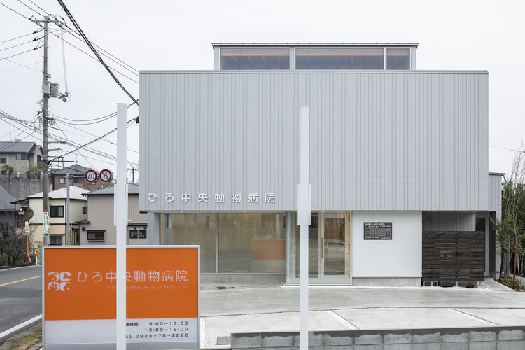
Create a space by creating difference in the brightness. This architecture consists of a house and a veterinary hospital.The client requested stable lighting and many small rooms at the vet clinic. The housing part is contrasted with them. We designed space where clients can feel the natural light positively and relax.
House in Miashi / Daisaku Hanamoto Architect & Associates - Interior Photography, Windows
© Kenji Masunaga
House in Miashi / Daisaku Hanamoto Architect & Associates - Image 24 of 25
First Floor Plan
House in Miashi / Daisaku Hanamoto Architect & Associates - Interior Photography
© Kenji Masunaga

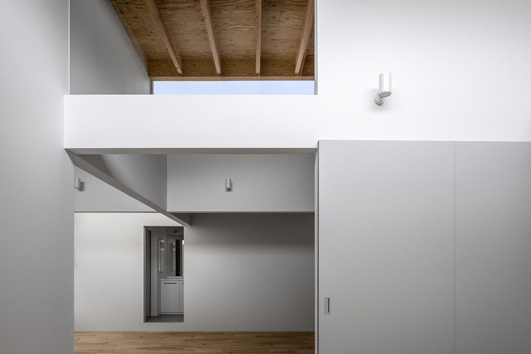
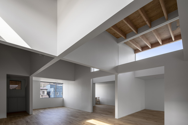
In this house, the theme was to create a space by creating difference in the brightness that appears on the floor, walls, and ceiling that make up the building. In order to be able to feel the subtle differences created in the floors and walls, the planning will be flexible room that can overlook many surfaces at the same time.

House in Miashi / Daisaku Hanamoto Architect & Associates - Interior Photography, Beam
© Kenji Masunaga

The hanging walls (Tarekabe) divide the ceiling into a grid shape to block the line of sight Moderately and brings depth and rhythm to simple spaces. The divided ceiling surface has a clear lightness difference due to the relationship such as the size of the opening and the sense of distance.  And the rough finish emphasizes its presence. It is predicted that the perception of light on the floor and walls will weaken as start living and furniture are placed.   However, this ceiling has always remained the frame of this architecture.

House in Miashi / Daisaku Hanamoto Architect & Associates - Exterior Photography
© Kenji Masunaga

Project gallery

See allShow less
About this office
Cite: "House in Miashi / Daisaku Hanamoto Architect & Associates" 20 Aug 2020. ArchDaily. Accessed . <https://www.archdaily.com/945943/house-in-miashi-daisaku-hanamoto-architect-and-associates> ISSN 0719-8884

© Kenji Masunaga

广岛三志住宅,兽医院与家的结合 / Daisaku Hanamoto Architect & Associates

You've started following your first account!

Did you know?

You'll now receive updates based on what you follow! Personalize your stream and start following your favorite authors, offices and users.